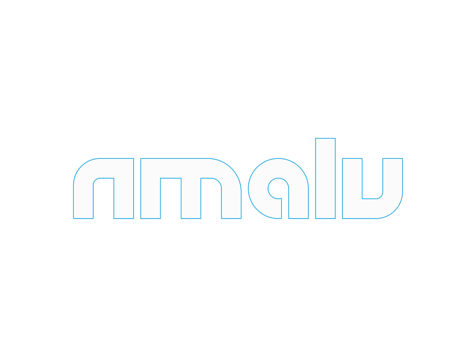
NMALU
Industry: Personal Clothing Brand
Created for NMALU, this identity was designed for a New Jersey apparel brand merging streetwear, prep, and luxury into a refined everyday aesthetic. The brand direction was shaped by themes of family, quality, and cultural style, with the goal of building a scalable ready-to-wear presence.
Process & Exploration
Sketch exploration produced multiple directions before refinement. Concepts were reduced to their most essential forms, prioritizing clarity and functional performance.


Refinement
Sketch exploration produced multiple directions before refinement. Concepts were reduced to their most essential forms, prioritizing clarity and functional performance.


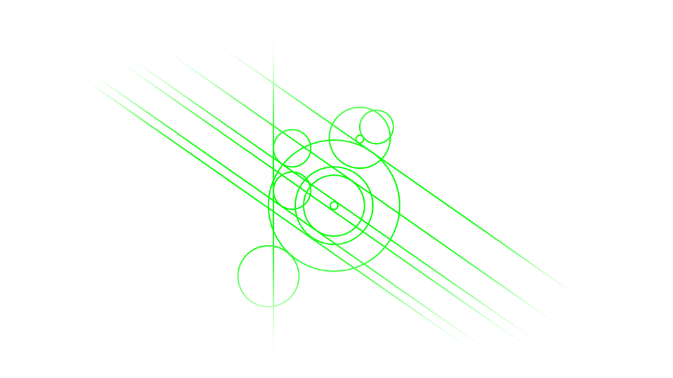
Following the completion of the wordmark, the client requested an accompanying icon after responding strongly to the final direction. Although I do not often develop a standalone symbol after resolving the primary mark, this was a meaningful exception. Since “Swan” was a nickname associated with him, I designed a swan icon using the same grid structure and formal language established in the wordmark, creating a cohesive extension of the identity.


Do you like this Icon?
0%
0%

Thanks for Voting!