Vepro Property Group
Real Estate / Property Management
VEPRO Property Group is a South Carolina-based real estate startup focused primarily on residential properties. The goal of the identity was to create a logo that felt professional, unique, distinct, and simple while reflecting themes of land, location, and action. Guided by references to flipping land, empty lots, and execution-driven real estate, the brand was developed with a clean black-and-white foundation and flexibility for future color applications.
Process & Exploration
Sketch exploration produced multiple directions before refinement. Concepts were reduced to their most essential forms, prioritizing clarity and functional performance.


Presented here are the initial rough draft designs developed from the sketches above.


Refinement
Shown here is the final logo design, developed through repeated refinement to ensure clarity, balance, and overall effectiveness.

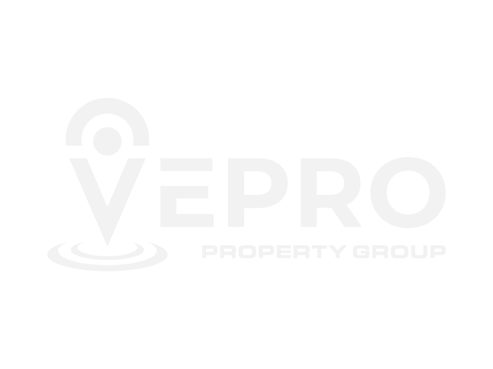


I chose to incorperate a GPS symbol in the "V" of the logo. This concept ties directly to the brand’s connection to land, location, and residential real estate, resulting in a mark that feels both professional and purposeful.


Which Logo
do you prefer?
Please use the appropriate button below to cast your vote.
0%
0%


Thanks for Voting!